hist(x, breaks = "Sturges", freq = NULL, ...)
Following is a csv file example "histogram.csv", we will draw a Histogram of "Expression" values:
>x <- read.csv("histogram.csv",header=T,sep="\t")
>x <- t(x)
>ex <- as.numeric(x[2,1:ncol(x)])
Plot a histogram:
>hist(ex)

The above plot is just a basic histogram. Let's add some parameters:
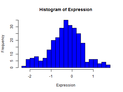
•br=20,#divide the data into 20 bars •col="blue",#fill in blue color •main="Histogram of Expression",#title of the histogram •xlab="Expression",#x axis description •ylab="Frequency",#y axis description •freq=TRUE,#y axis is the frequency of each interval
Here is the command:
>hist(ex,br=14,col="blue",xlab="Expression",ylab="Frequency",
+freq=TRUE,main="Histogram of Expression")
To add a density line into the histogram, we need to change two parameters:
•freq=FALSE,#y axis is the density value of each interval •ylab="Density",#y axis description as Density
Here is the command:
>hist(ex,br=14,col="blue",xlab="Expression",ylab="Density",freq=FALSE,
+main="Histogram of Expression")
>lines(density(ex),col="red")

We can write the plot into a file:
>png("histogram3.png",400,300)
>hist(ex,br=14,col="blue",xlab="Expression",ylab="Density",
+freq=FALSE,main="Histogram of Expression")
>lines(density(ex),col="red")
>graphics.off()
List of

